Terminal Noise & Quiet Hours
Notes on ASCII art, high-contrast assets, and surviving the learning curve.



Most design systems try way too hard to be squeaky clean. They strip out all the soul until every site ends up looking like a generic SaaS platform trying to sell you enterprise software.
Personally? I prefer the visual grit: high contrast, heavy ink, and pure digital noise.
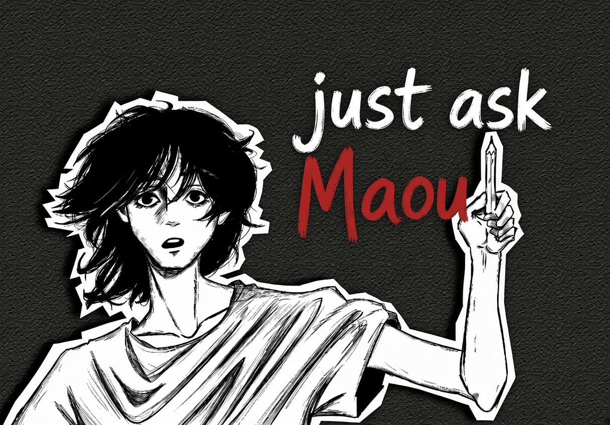
When you're first getting into web development, the entire tech stack feels like a puzzle you never asked to solve. Omo, you'll spend three full hours fighting missing semicolons, broken relative image paths, and layout bugs just to get a single paragraph to show up properly on a dark screen.

Most days the reaction is just pure fatigue. What a drag.
You end up burning through your laptop battery trying to debug centered elements, staring at blank screens, and wondering why on earth plain HTML takes so much emotional effort just to look decent.
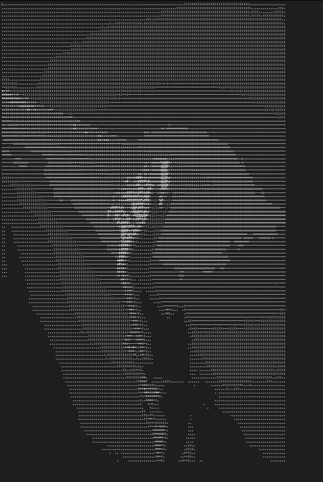
That's exactly why the ASCII look hits different. It strips everything right back to the terminal. No heavy JS bundles, no bloated layout engines, just raw text characters doing all the work to render light and shadow. It's fast, lightweight, and completely immune to whatever new framework released five minutes ago.
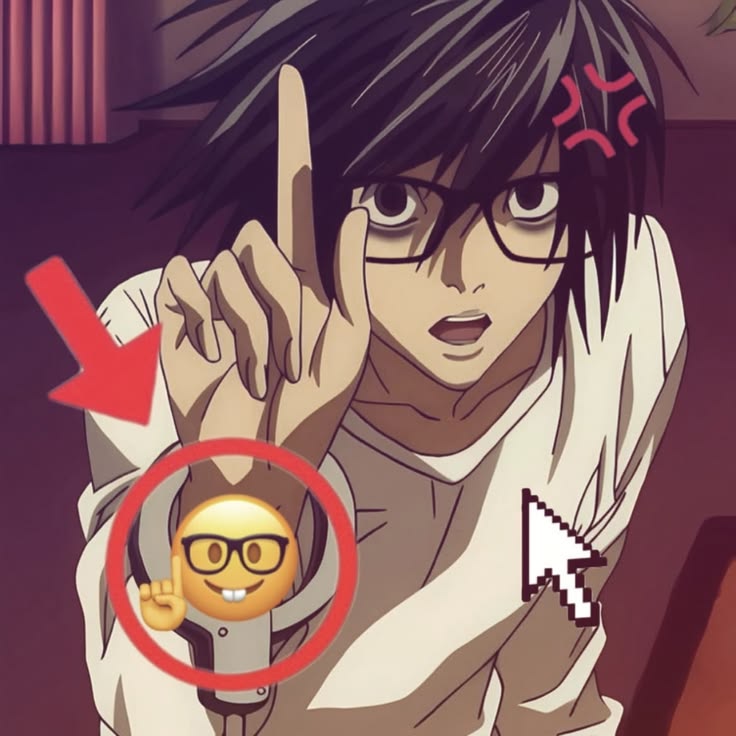
"So why not just grab a pre-made component library like everyone else?"
Because building an actual visual identity means leaning into the weird contrast. You pair raw monospace terminal text with dark zine cutouts, throw in a couple of unbothered anime stills, and let it breathe.
It doesn't need to look polished for a corporate board room pitch. It just needs to load instantly, look dark, and actually feel like a human built it.